BRAND:
EVERGROVE
YEAR:
2023
EXPERIENCE:
PACKAGING DESIGN | ILLUSTRATION

about.
Evergrove is a jam packaging design project that draws from the meaning of its name—ever, symbolizing continuity, and grove, representing a natural sanctuary of trees. Together, “Evergrove” evokes the idea of a hidden haven that preserves nature’s bounty in the form of exquisite jams. The design has a soft, vintage charm that encapsulates the sweet flavors of jam and stirs a sense of nostalgia, reminding people of simpler times—like enjoying a nice family picnic with their favorite jam.


nostalgia.
Evergrove’s visual branding and identity blends tactile charm and natural storytelling across both the pouch and the jar packaging. The pouch features a cut-out square window that reveals the jar inside, which creates a layered moment of discovery. Varying watercolor style fruit illustrations, a gingham background, and a doily border express handmade care and a sense of nostalgia. Each of the flavors is color coded with delicate, fruit-inspired tones, reinforcing the brand’s connection to the essence of a natural world.


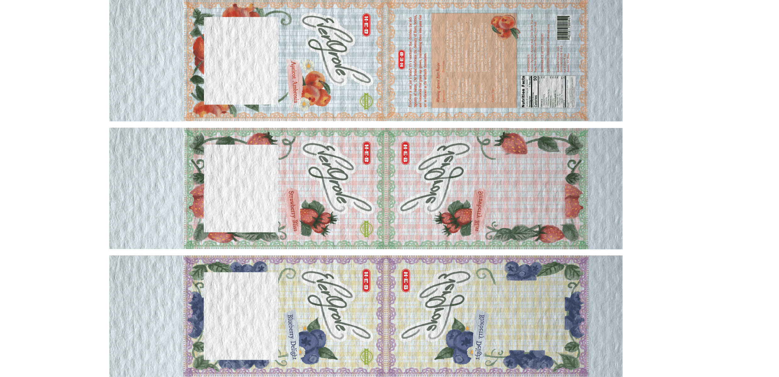
the jar.
The glass jar, embossed with the Evergrove logo and ornamental details, offers a premium tactile experience for buyers. Its gold lid and vertical ribbon label add a touch of sophistication while staying rooted in rustic charm. Together, these elements create a timeless package that reflects Evergrove’s mission to preserve nature’s pure sweetness through thoughtful and beautiful design.


