BRAND:
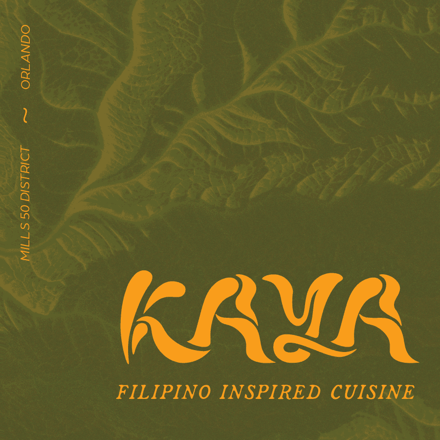
KAYA
YEAR:
2023
EXPERIENCE:
LOGOTYPE DESIGN

about.
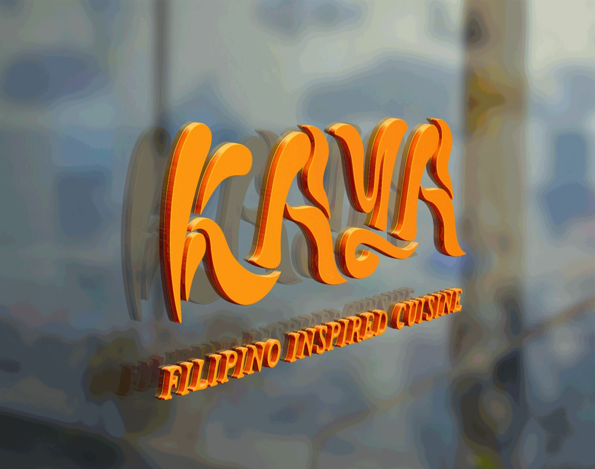
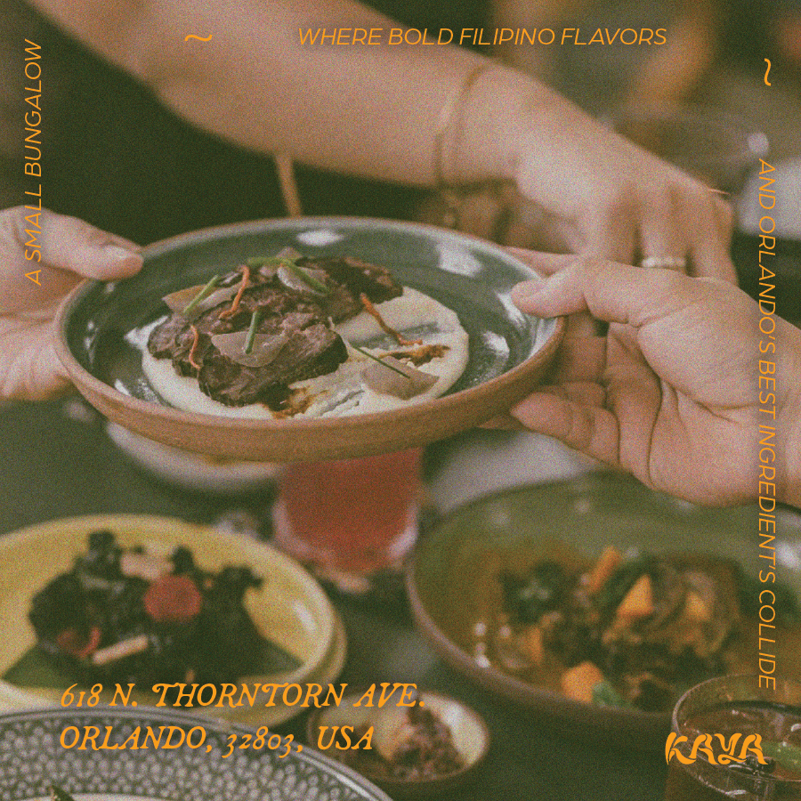
KAYA is a logotype rebrand project for a Michelin-star Filipino restaurant that offers a refined take on traditional cuisine. Inspired by items students brought from home, the challenge pushed us to explore organic forms and unconventional materials to create a visual identity. I chose KAYA for its commitment to fresh, local ingredients and innovative techniques that elevate classic Filipino dishes for both authentic and adventurous diners.
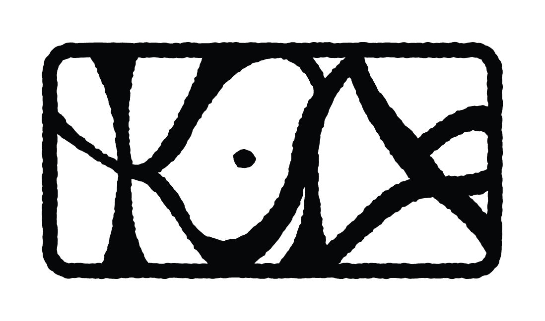
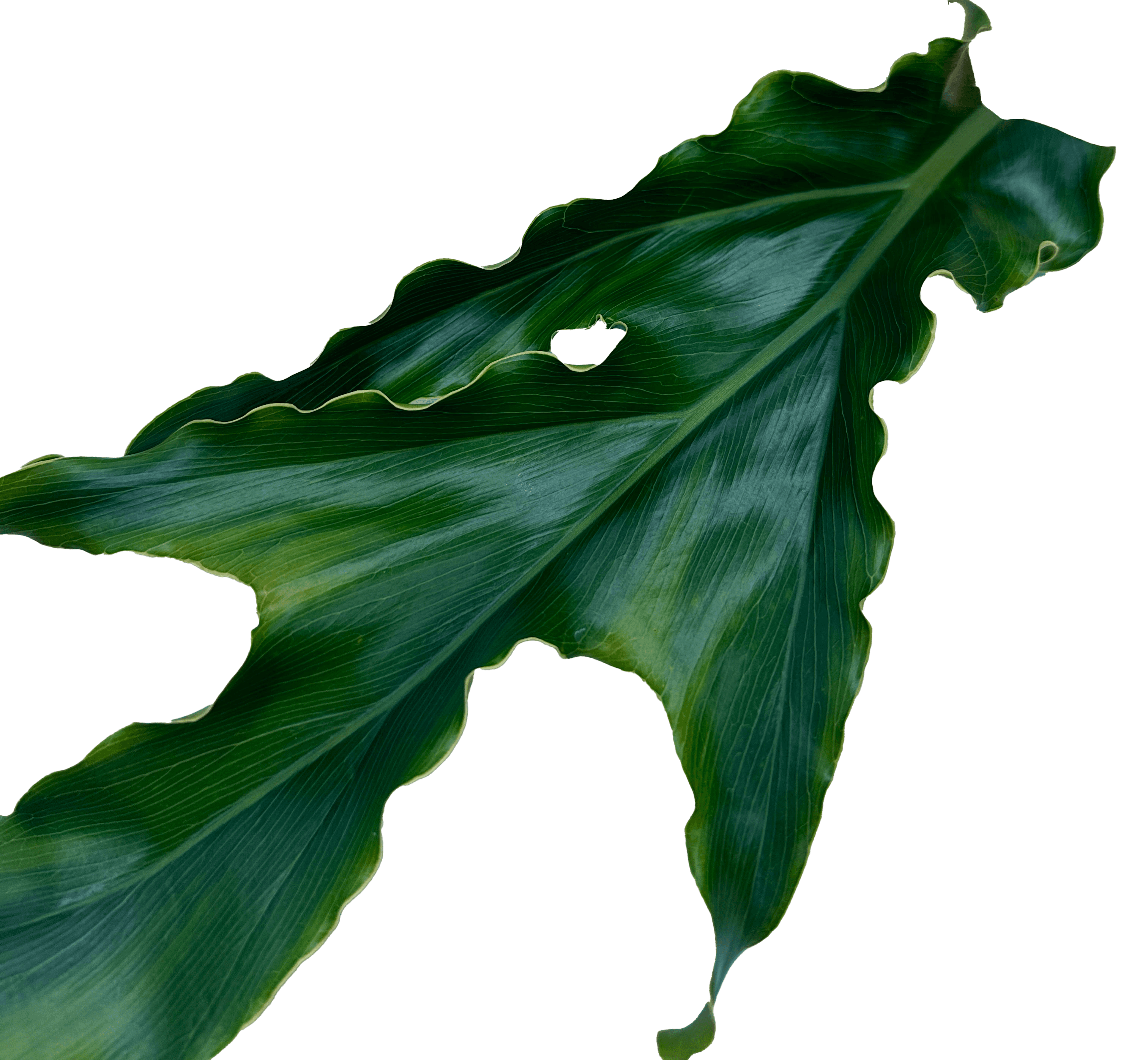
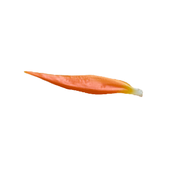
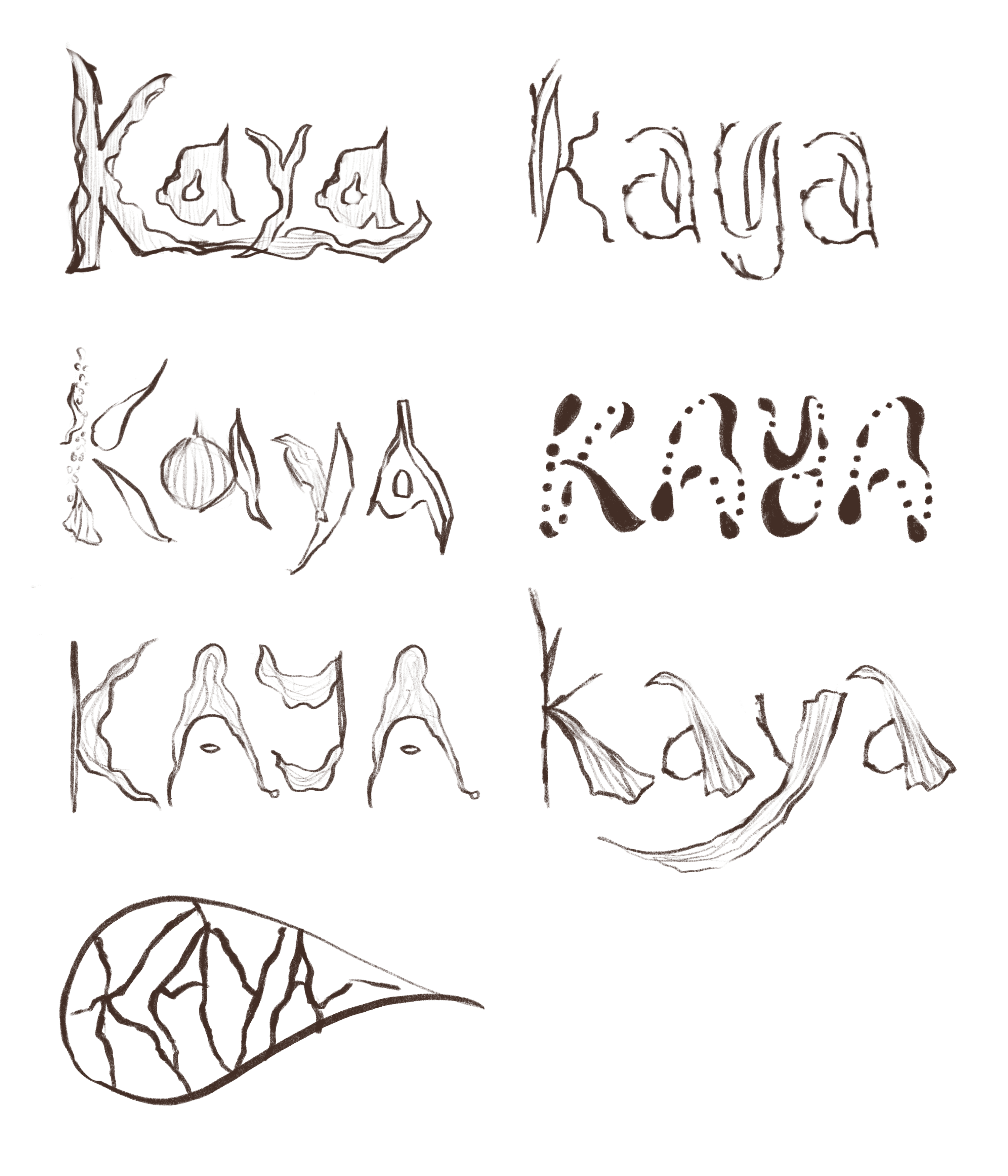
Drawing from the variety of objects brought in, I observed their forms and sketched out initial logotype concepts. I ultimately chose one direction, using a leaf and an orange petal as the foundation, both echoing the restaurant’s emphasis on freshness and its frequent use of natural ingredients like leaves in its dishes. These elements closely align with the restaurant’s philosophy, as it emphasizes fresh ingredients and frequently incorporates leaves into its dishes. By studying the shapes and natural forms of these objects, I began sketching letterforms, ultimately developing a fluid and organic logotype that reflects the restaurant’s essence.
inspiration.
The bold, arching curves of the leaf informed the sweeping motions and rhythm within each letterform, inspiring silhouettes that feel alive and in motion. Its torn up edges and layered texture is translated into subtle asymmetries and unexpected negative space in the logotype, including a sense of organic imperfection. The orange petal, with its tapering point and smooth, elongated body, helped with outlining the finer, more delicate framework, especially in the terminals and inner curvature of the letterforms. These natural components introduce contrast joined by balance of softness and sharpness, grounding the designs in nature while also reflecting Kaya’s refined and expressive identity.

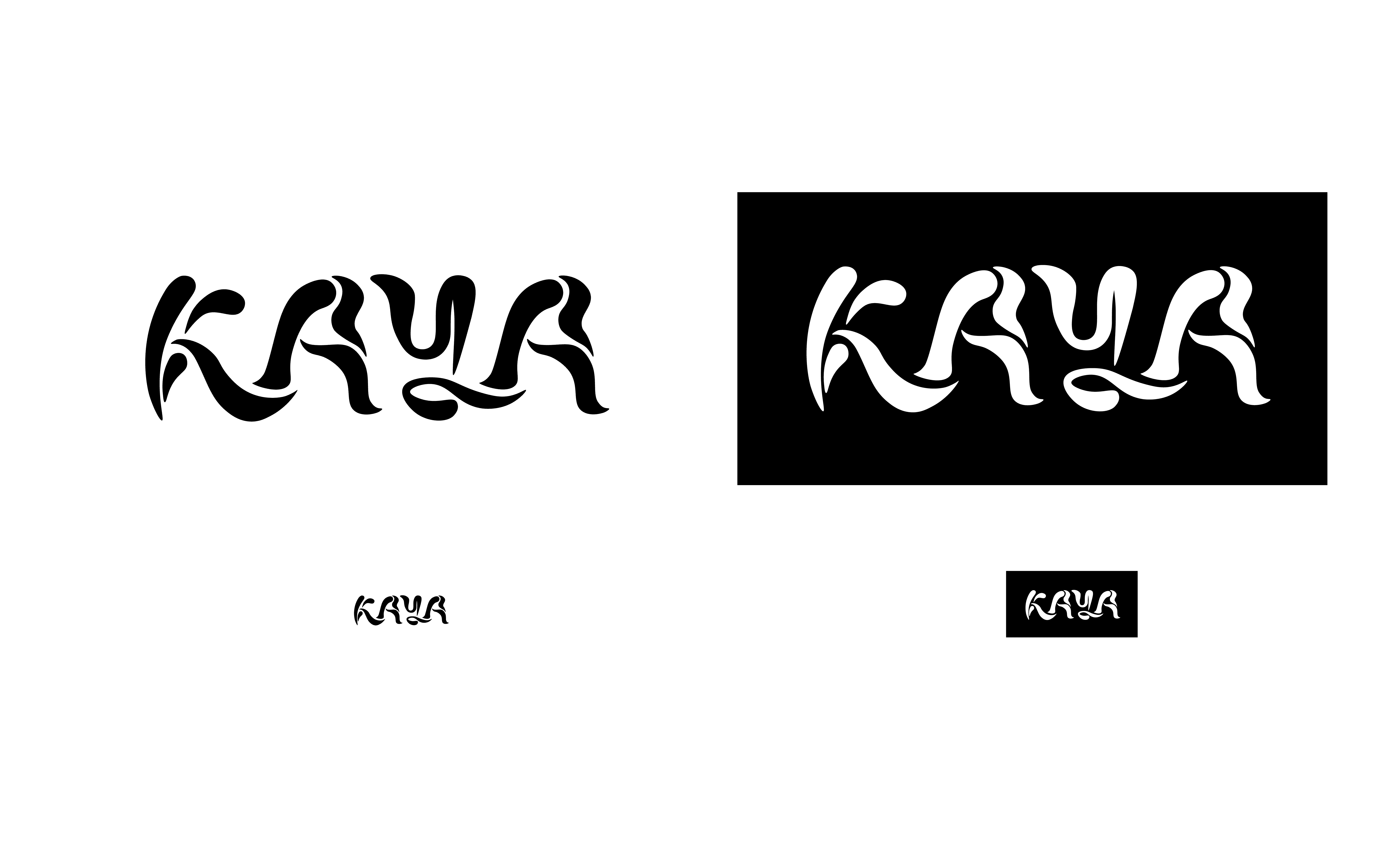
final.
The final logotype brings together natural elegance and thoughtful design, embodying a visual rhythm that feels both grounded and elevated. The interplay of organic shapes and refined forms mirrors the restaurant’s balance of tradition and innovation, resulting in a cohesive identity that feels intentional, expressive, and true to the spirit of KAYA.